Redesigned Hello Edu’s logo and website, focusing on user-centered branding, style exploration, and content organization to improve workflows and client collaboration.”

Hello Edu Tutoring | Amanda Sinnott, M.Ed
Brand Designer, UX/UI Designer
6 Weeks
Brand identity, logo system, visual style, UX structure, responsive website design
Hello Edu needed a refreshed brand identity and website that better reflected the professionalism, warmth, and clarity of their tutoring programs. Amanda approached me to modernize the logo, elevate the visual language and redesign the website so parents and students could easily understand their services and connect with her programs. I led the brand and UX/UI redesign from strategy to final execution, creating a cohesive identity and digital experience that communicates Hello Edu's energy, growth, and accessibility.
“This feels like a big step for my business, and I’m excited to see you elevate the brand!” - Quote from client communication

The client's existing website and logo lacked cohesion and professional polish, limiting brand impact. She needed a scalable, visually engaging platform that could support multiple integrations, Amazon shop links, stripe, social media links, a blog, and Google reviews, while increasing visibility, driving user engagement, and generating more inquiries.
To inform the redesign, I conducted a comprehensive review of Hello Edu’s existing brand and website, identifying inconsistencies in visual identity, typography, and user experience. I also spent time understanding Amanda, her programs, and her audience to ensure the new design reflected her vision.
Key redesign steps:


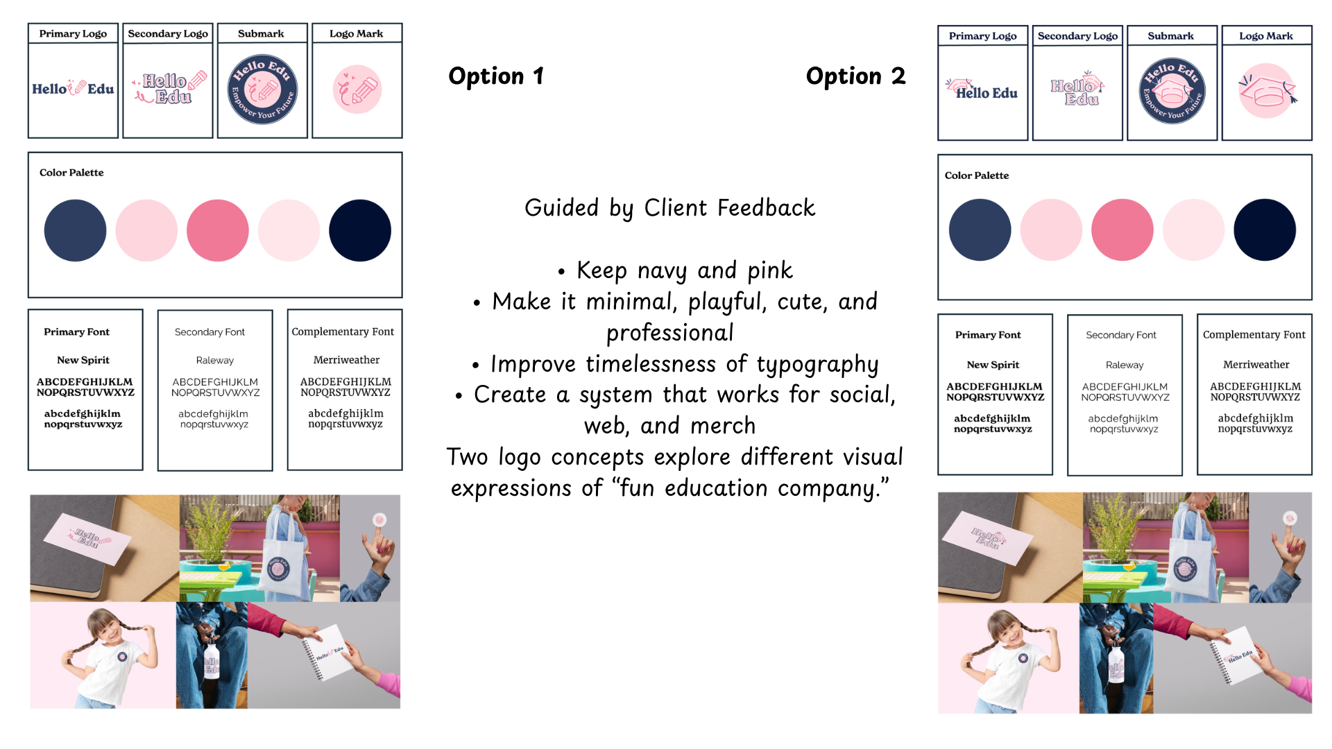
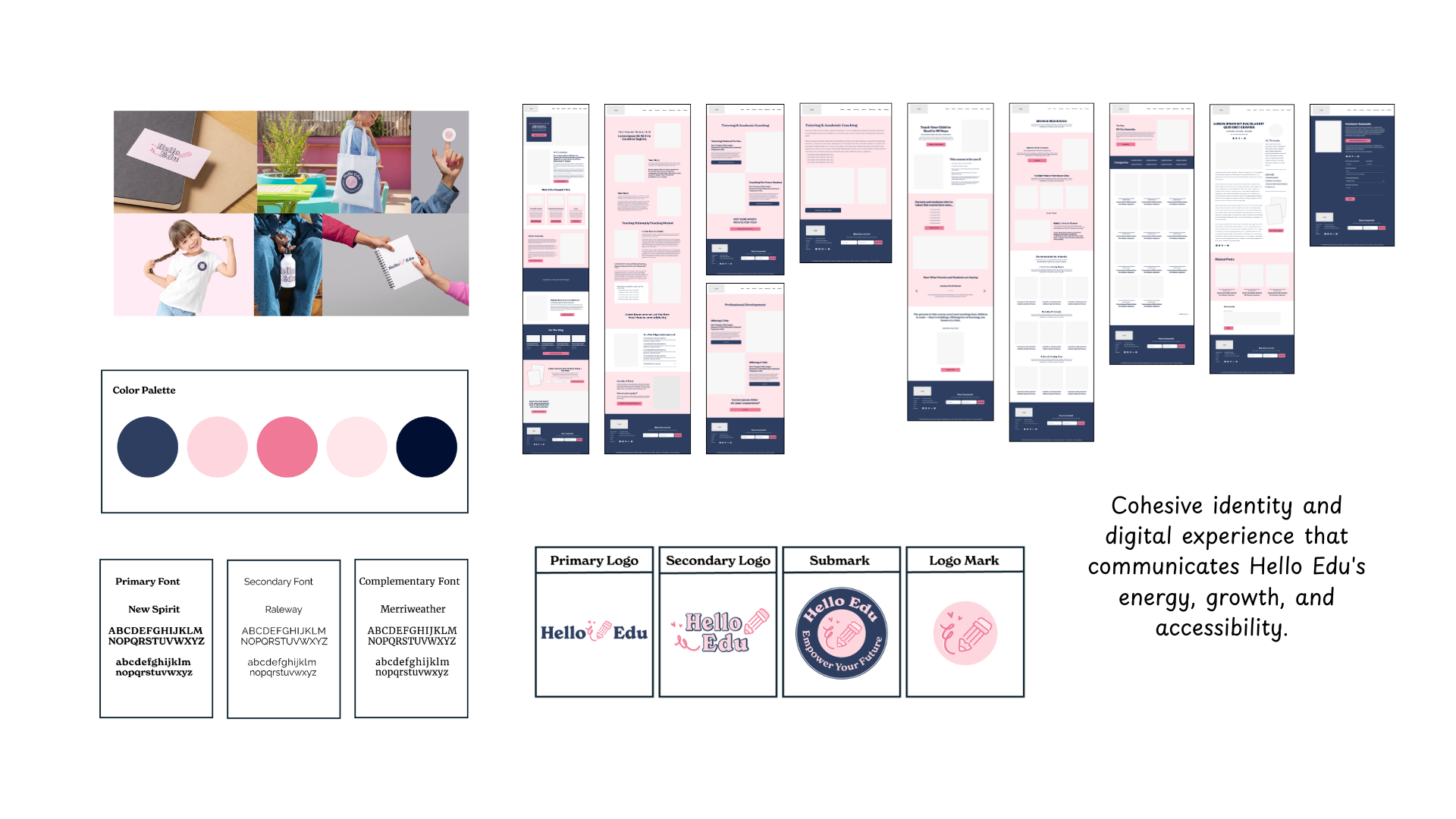
I began by sketching concepts that aligned with the existing site flow and incorporated Amanda's key needs, such as her Amazon shop, Youtube channel, and core resources. Then I explored what additional content her audience (parents, students, and educators) might be looking for, sketching an option that would highlight learnings games, printable worksheets, and recommended articles. I also tested a layout that reduced scrolling by highlighting featured content before displaying her amazon shop products. Ultimately, I combined elements from the first and second sketches to position Amanda as both a guide and a though leader, creating a structure that felt useful, intuitive, and supportive of her goals. I then translated the sketches into grayscale wireframes, built an interactive prototype focused on usability, and prepared the foundation for high-fidelity designs that would bring the refreshed brand and final experience to life. This was then presented to the client for review.


I set out to create a brand identity that felt minimal, playful, cute, and professional while keeping the existing navy and pink palette. I explored a range of logo concepts using familiar education symbols like pencils and graduation caps paired with unique elements such as swirls and heart shapes to add personality. I refined the color palette for better cohesion and accessibility and built a layered type system using New Spirit, Raleway, and Merriweather to balance character with readability. The final presentation included two cohesive directions: one centered on the act of learning (pencil) and one focused on achievement (graduation cap), each supported by a full modular logo system for flexible use across digital and print.


Although the project did not progress to final development, the process offered clear guidance on Hello Edu's potential design direction and demonstrated the value of thorough visual exploration.

Completed work, including logo concepts, typography options, and layout prototypes, established a cohesive foundation to inform future design decisions and communicate Hello Edu’s energy, growth, and accessibility.


I kept our collaboration organized and transparent using a shared trello board, which let us track the project from discovery through design and final deliverables. We paired this with email for sharing sketches, wireframes, and prototypes, making it easy for Amanda to give feedback at key milestones. This mix of clear tracking and consistent communication ensured a smooth, collaborative workflow throughout the project.

This project reinforced the importance of establishing early visual alignment through mood boards, style exploration, and typography direction, especially when clients struggle to articulate their preferences. It highlighted the need to clearly define expectations and required content for each design stage and the value of exploring multiple directions while discussing trade-offs openly. The experience also encouraged me to seek guidance from other designers and refine my onboarding process to ensure smoother collaboration on future projects.
