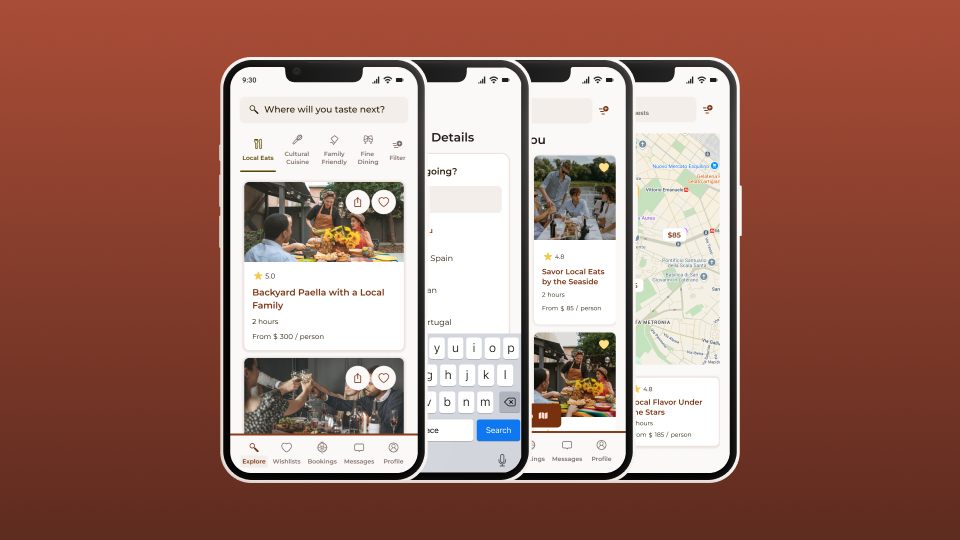
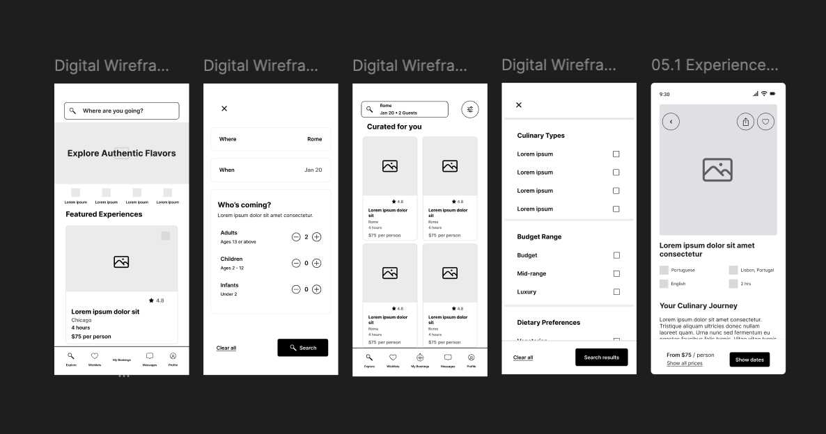
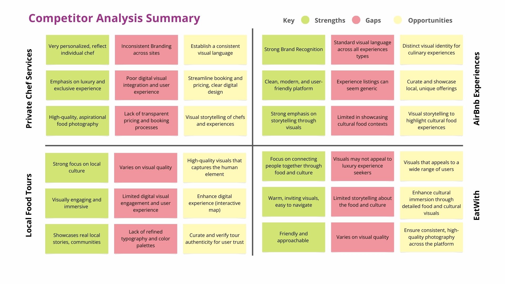
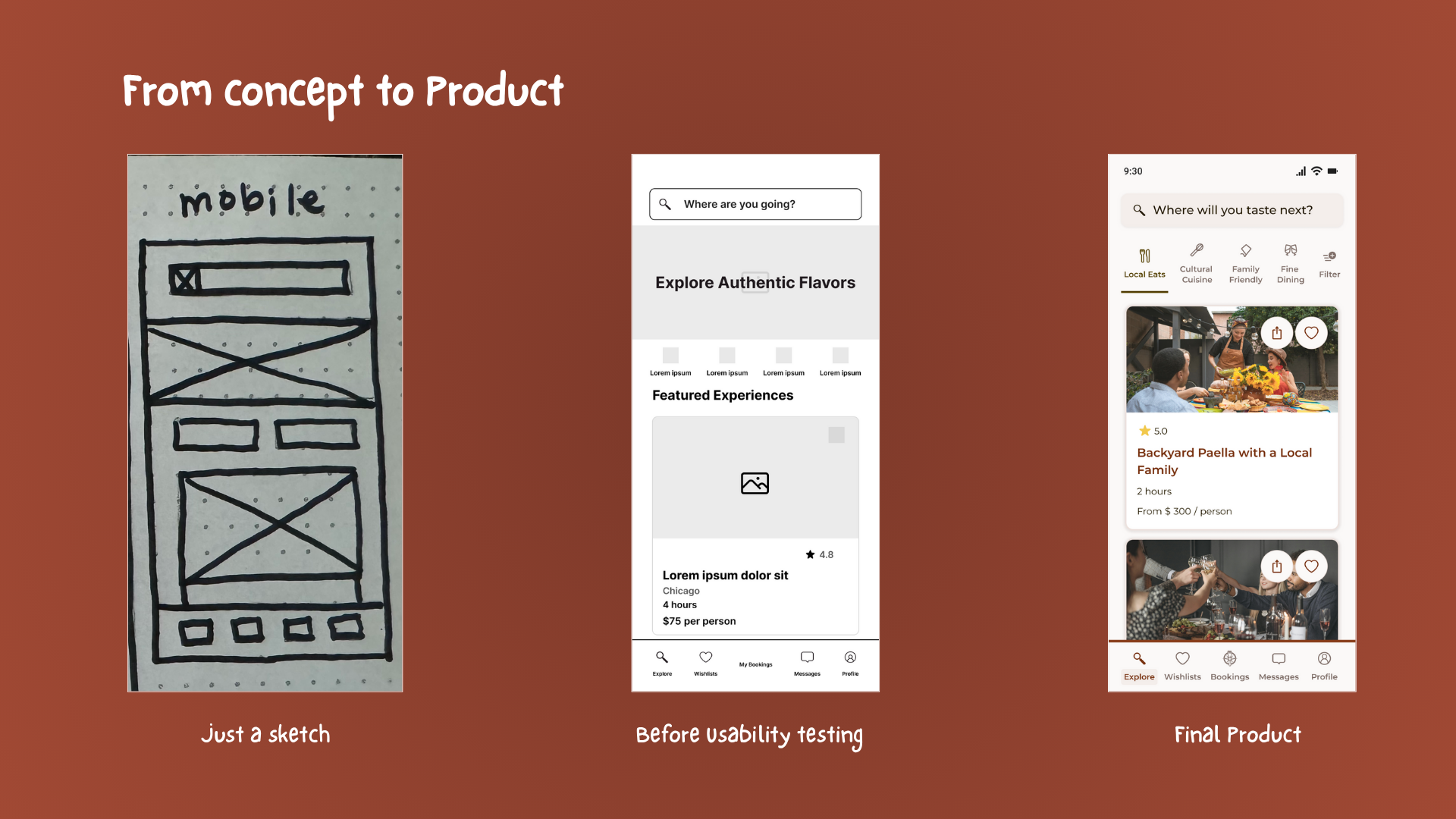
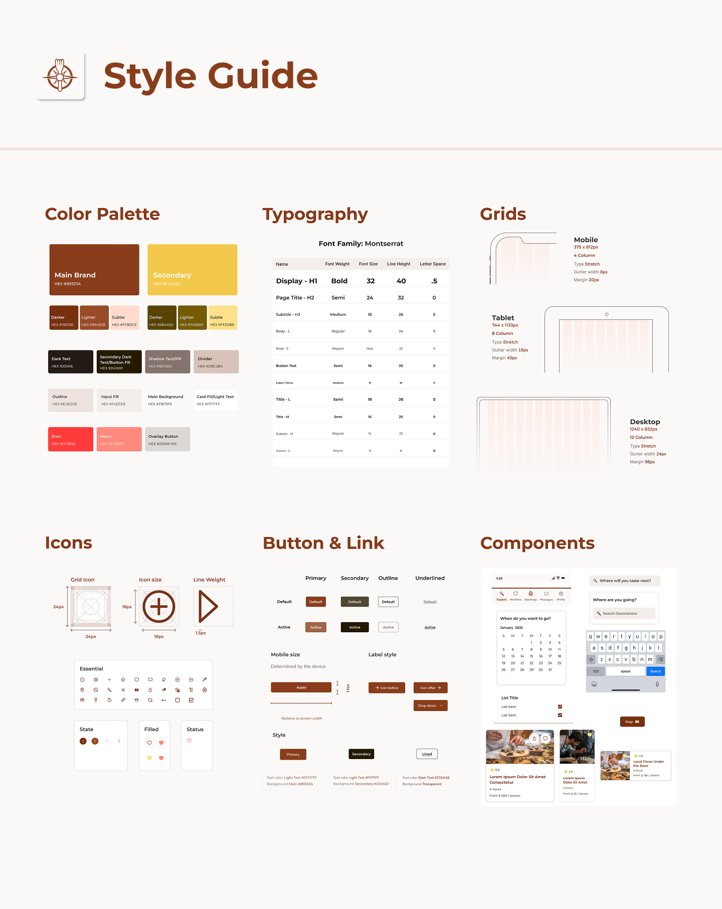
Defined a cohesive visual language for TasteVoyage’s app, including color palettes, typography, and UI components, creating an inviting and intuitive culinary travel experience

Fictional – TasteVoyage
Visual Designer
3 Weeks
Created a cohesive design system, high-fidelity screens, and scalable UI guidelines.
In this project, I built the visual foundation for TasteVoyage, a mock culinary travel app that connects travelers with authentic local food experiences. The goal was to bring the brand to life through thoughtful design choices in color, typography, and layout, creating a cohesive and scalable visual system that feels warm, authentic, and inviting.

To shape TasteVoyage’s visual identity, I analyzed competitors such as EatWith, WithLocals, and Airbnb Experiences to uncover strengths, weaknesses, and common design patterns. This revealed an opportunity for a warmer, more human-centered approach to culinary exploration. I explored multiple visual directions inspired by earthy tones, handcrafted textures, and clean, modern layouts, each emphasizing discovery through food and travel while evoking a sense of adventure and authenticity.


While developing TasteVoyage’s visual language, I also considered how the visual identity would support intuitive navigation, clear information hierarchy, and engaging user flows. For a detailed look at the UX process, including research, wireframes, prototypes, and usability testing that informed these design decisions, see the full case study Designing Culinary Journeys with Users in Mind.

After finalizing the direction, I built a cohesive design system that included:
This evolved into high-fidelity mockups showcasing onboarding, search, and experience detail screens.

TasteVoyage’s final design delivers a cohesive, user-friendly search and discovery experience. High-fidelity screens showcase intuitive navigation, clear information hierarchy, and a visual language that balances warmth and clarity, guiding users seamlessly through onboarding, exploration, and experience details.

The design system strengthened brand recognition and visual trust through consistent iconography, typography, and color choices. It also created a scalable foundation for future UI enhancements and marketing touchpoints, ensuring a consistent, engaging experience across all platforms.

I used Google Forms to conduct user surveys, gathering insights on how travelers discover and book culinary experiences. I also recruited participants for a moderated usability test, which provided qualitative feedback to validate design decisions and inform iterations.
While working on this project, I learned the importance of building a strong visual foundation early in the design process. Inspired by Laying the Foundations by Andrew Couldwell, I approached the design system with both structure and creativity in mind. I also revisited my icons – originally from a community library – and redesigned them in Figma to feel more cohesive with the overall brand. The process reinforced how early visual decisions can directly shape usability and brand perception.