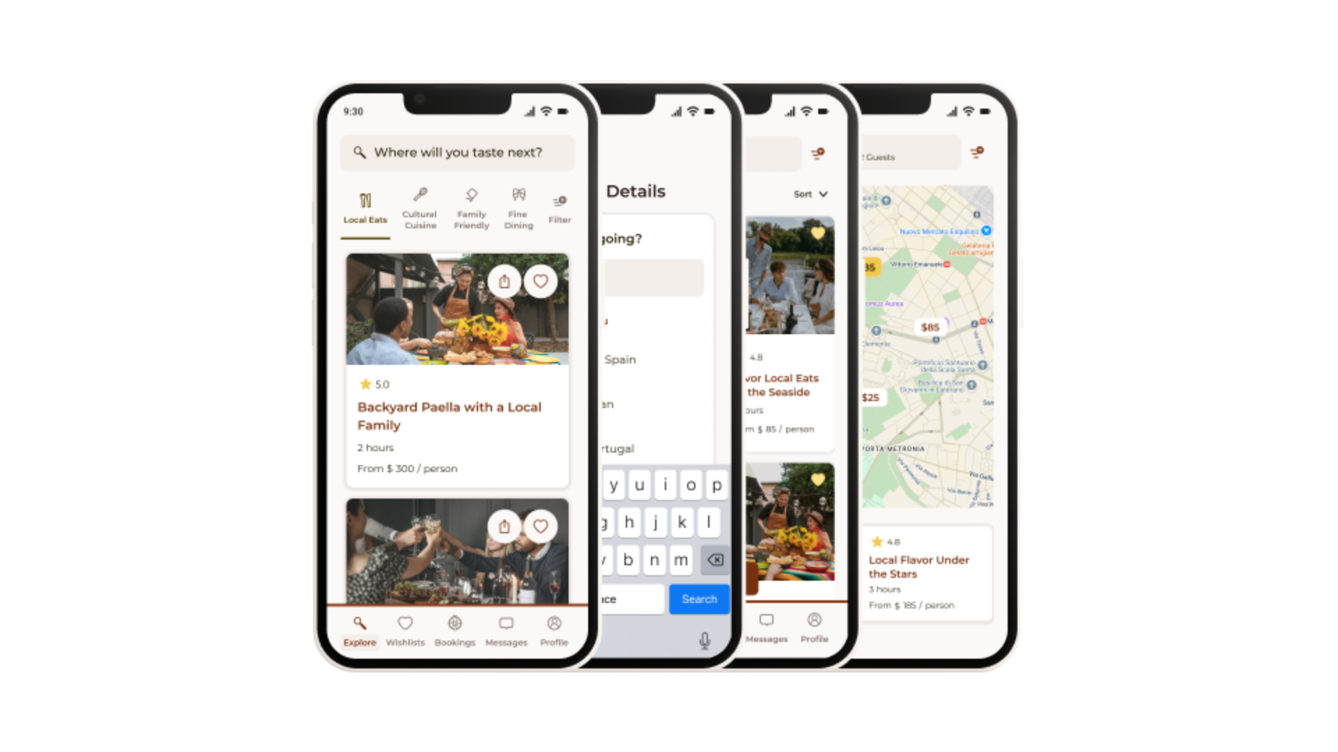
Led user-centered app design to enhance search and discovery of culinary experiences, including research, wireframes, usability testing, and high-fidelity prototypes for intuitive navigation.”

Fictional – TasteVoyage
UX/UI Designer
6 Weeks
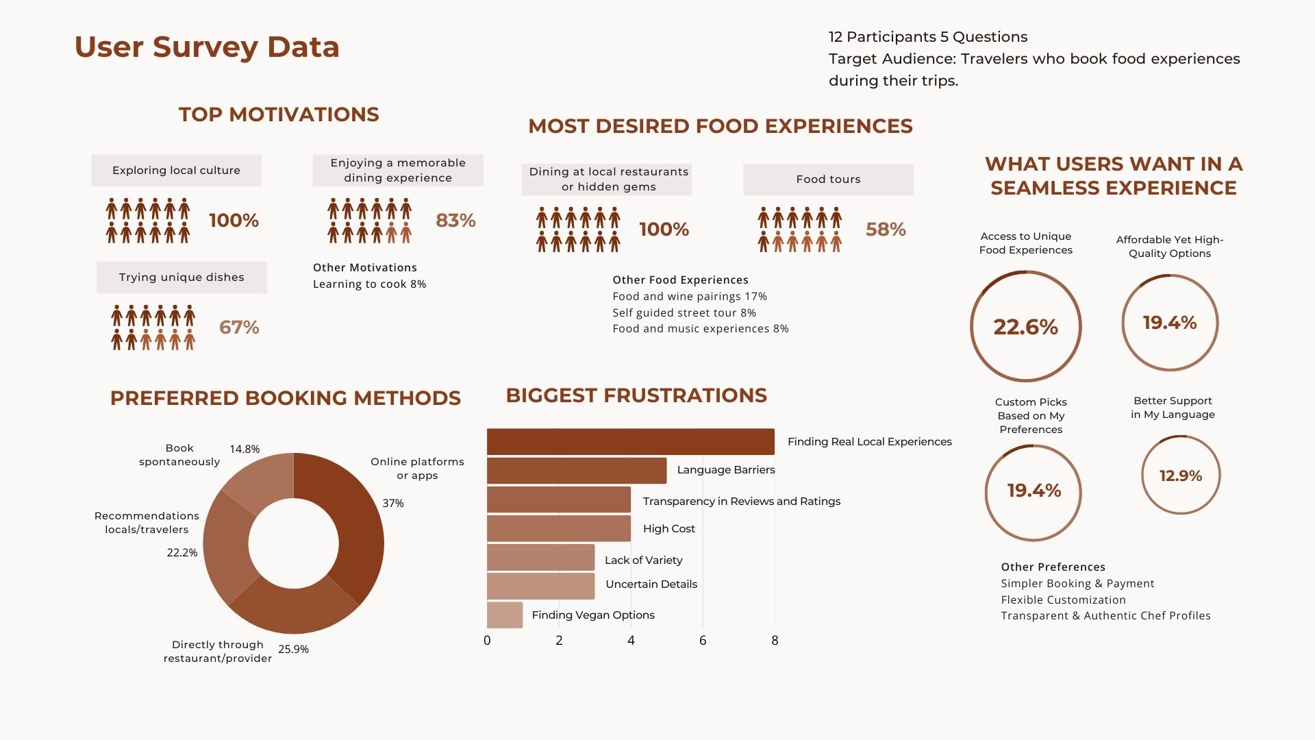
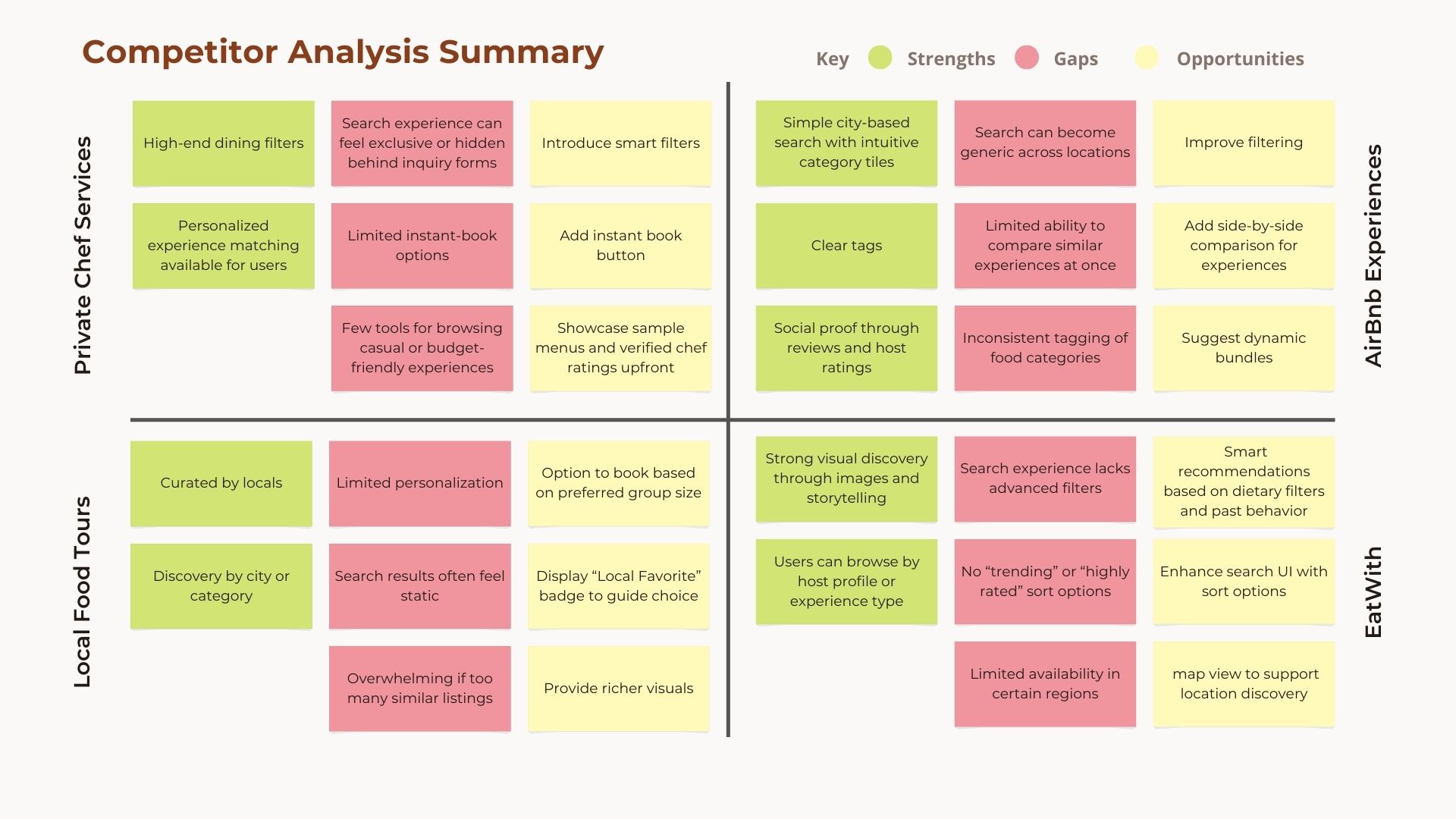
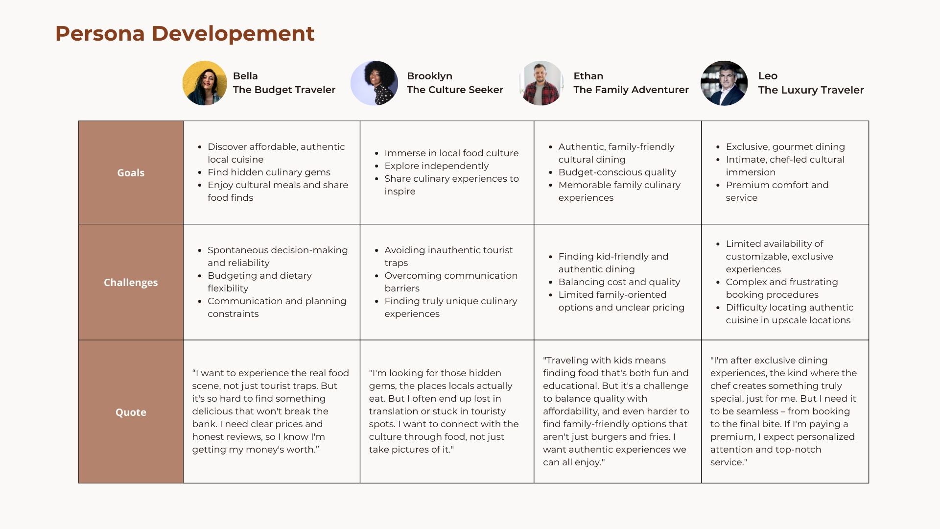
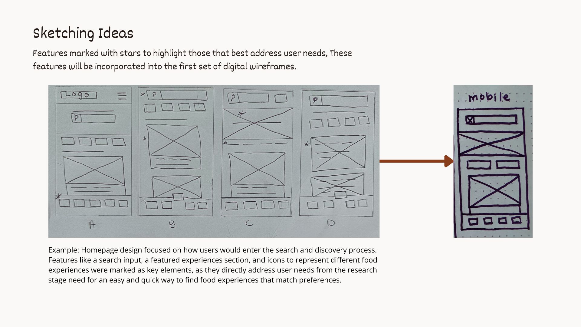
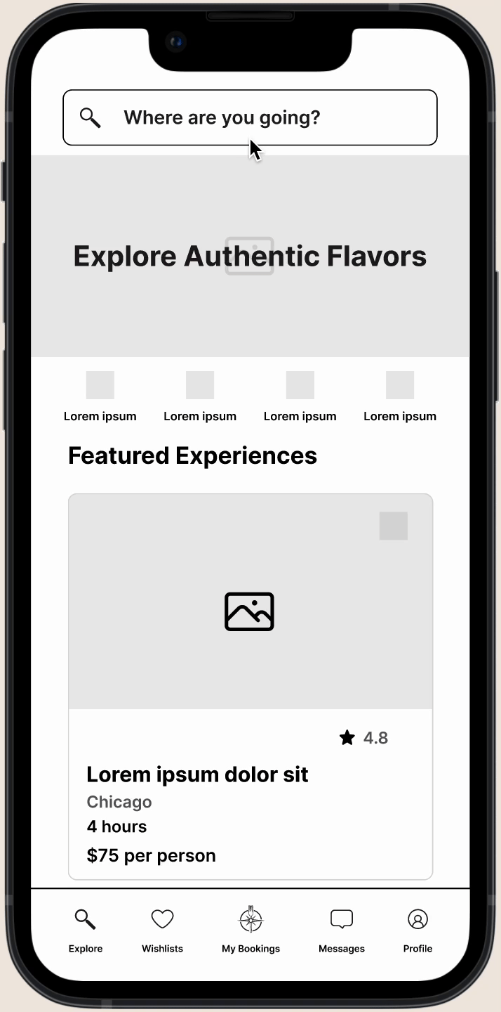
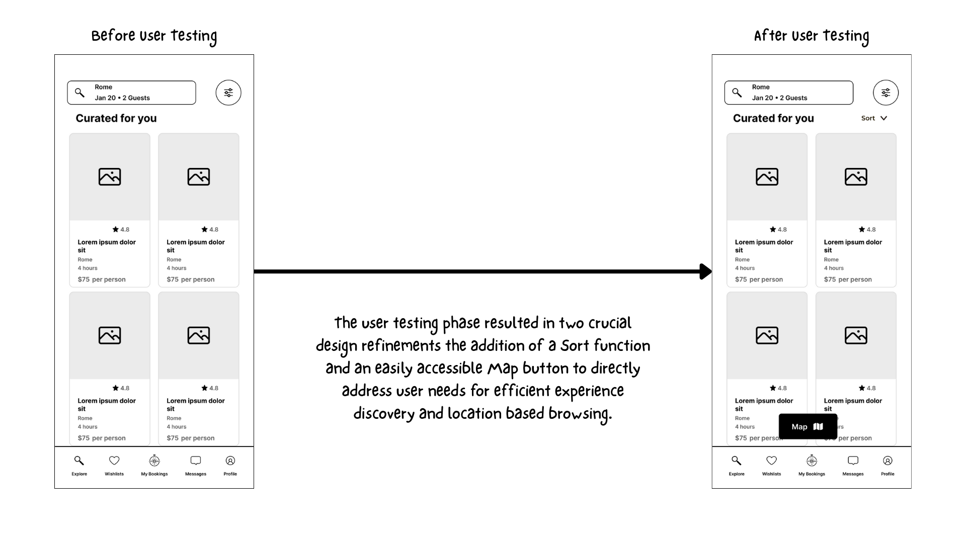
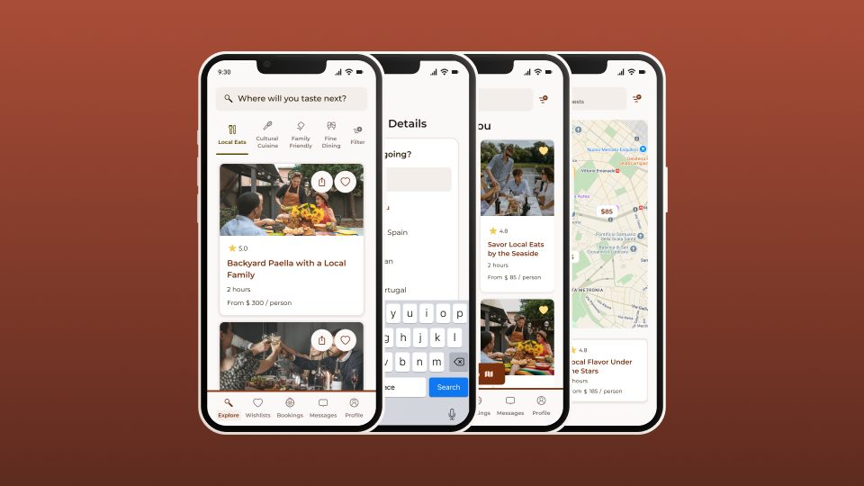
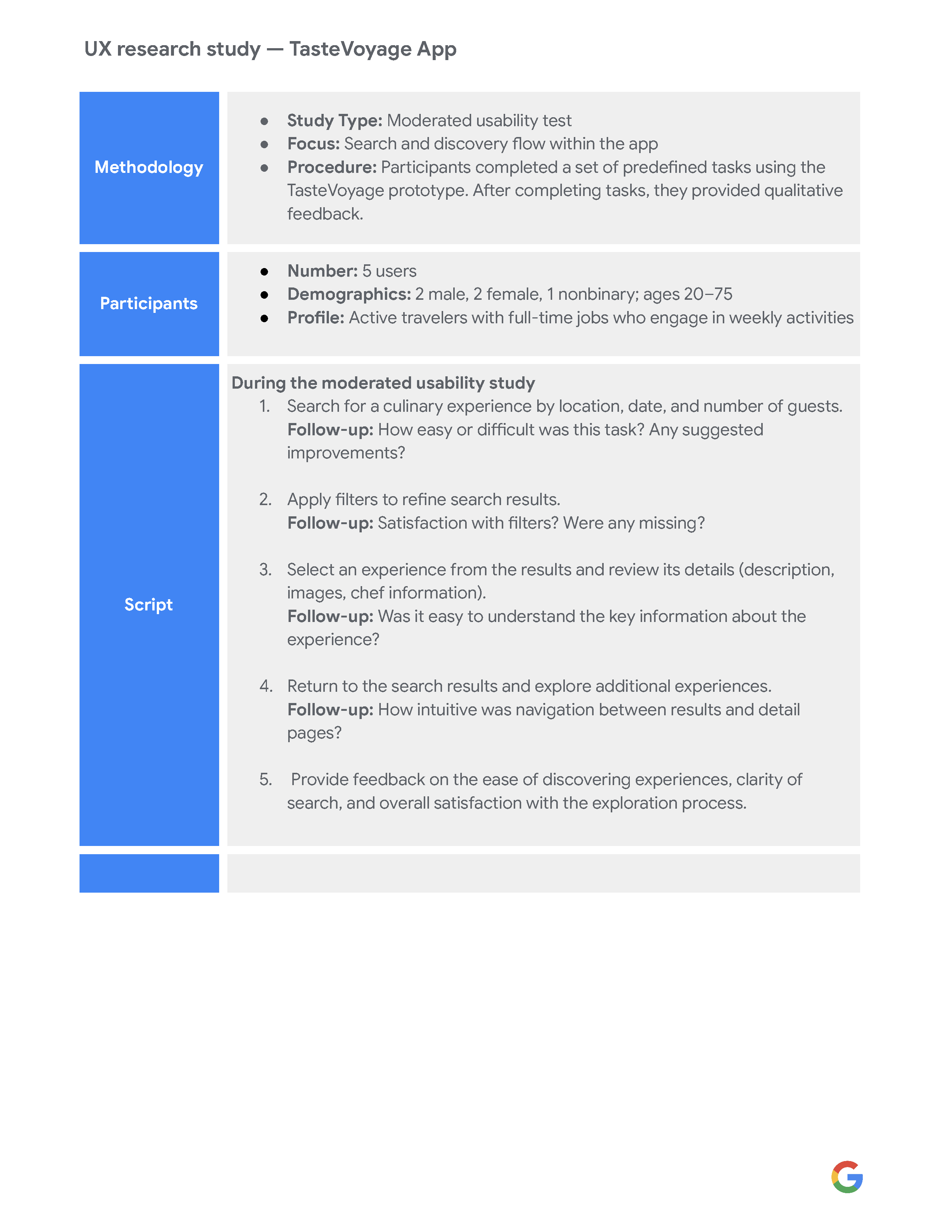
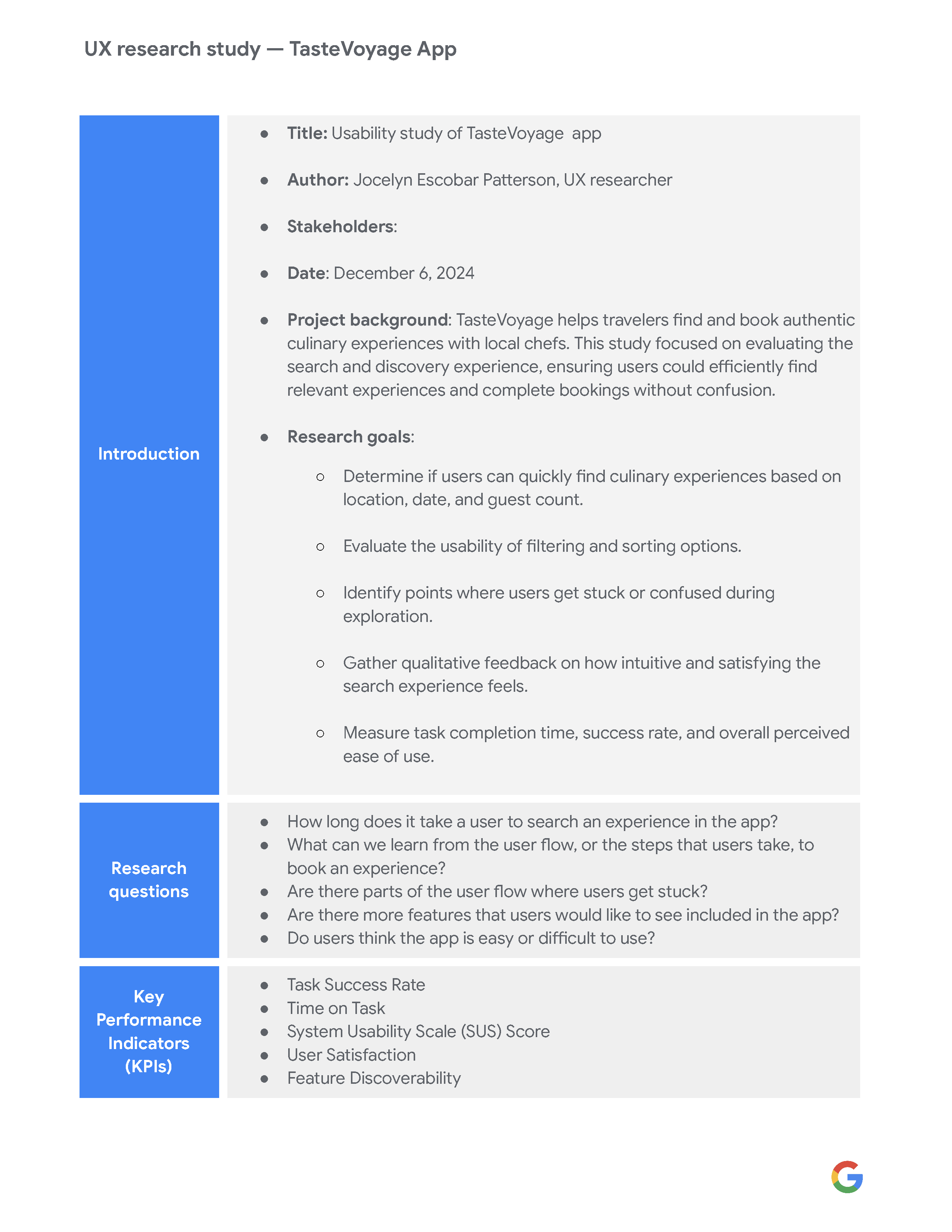
Phase 1 deliverables included user research and journey mapping, wireframes and an interactive prototype, UX recommendations for search and discovery, and usability testing insights.
TasteVoyage is a mobile app concept designed to help travelers discover and book authentic culinary experiences, ranging from private chef dinners to local food tours. The goal of Phase 1 was to improving the Search and Discovery experience, making it more intuitive, accessible, and engaging. The goal was to deliver personalized recommendations and streamline key user flows so travelers could quickly find meaningful local food experiences that match their interests.

Before diving into design, I set out to understand how travelers explore and book food experiences. By mapping user journeys and analyzing competitors like EatWith and Airbnb Experiences, I uncovered consistent frustrations –limited personalization and overwhelming search options. These insights revealed a clear opportunity for TasteVoyage to stand out with a more curated, user-centered search experience that adapts to each traveler’s tastes and interests.


I started by translating research insights into a clear user flow and information architectire for the search and discovery experience. Wireframes outlines key screens and navigation paths, ensuring travelers could easily browse, filter, and book, culinary experiences. Low-fidelity prototypes allowed early usability testing to validate the layout and flow, while high-fidelity prototypes refined interactions and visual hierarchy to support a cohesive, intuitive journey. Feedback from testing informed adjustments to navigation, content placement, and task flow, ensuring the structure met user needs effectively.


For TasteVoyage, I explored moodboard, color palettes, typography, and visual concepts to define a cohesive and inviting brand language. For a detailed breakdown of the full visual exploration, including logo options, imagery style, and concept directions, see the full case study here.

TasteVoyage’s final design delivers a cohesive, user-friendly search and discovery experience. High-fidelity screens showcase intuitive navigation, clear information hierarchy, and a visual language that balances warmth and clarity, guiding users seamlessly through onboarding, exploration, and experience details.

These design improvements set the platform apart from competitors and enhanced overall user engagement, making it easier for travelers to find meaningful, local food experiences aligned with their interests.
I used Google Forms to conduct user surveys, gathering insights on how travelers discover and book culinary experiences. I also recruited participants for a moderated usability test, which provided qualitative feedback to validate design decisions and inform iterations.


One key takeaway from this project was the importance of building and refining the user journey with a user-first mindset. Initially, I focused on the overall experience, including search, discovery, and booking processes. However, I chose to narrow my focus to the usability study specifically on the search and discovery phase. This approach allowed me to gather more targeted feedback, make clearer design decisions, and confidently refine the experience through the subsequent stages of the project.